


Commercial Design Awards
2017 Commercial Design Awards
The winning designs represent spaces where collaboration, innovation and comfort are front and center.
By Stephanie Towne Benoit
Jul 2017

More than most, designers and architects realize how important good design is to a productive work environment. When we asked local designers to share their best recent work with us for the second annual Biz 417 Commercial Design Awards, we were impressed. Ultimately we left it up to Julia Kirkendall—founder and principal designer at Kirkendall Design Firm in Tulsa, Oklahoma—to judge each project based on aesthetics, design skill and narrative explanation. The winning designs represent spaces where collaboration, innovation and comfort are front and center.
WINNING DESIGNS
General Commercial Space
Hospitality
Historical Renovation
Medical
Finance/Legal
General Office Space
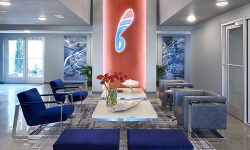
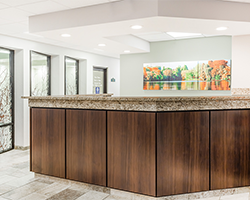
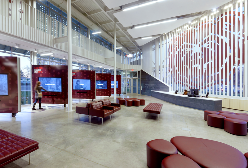
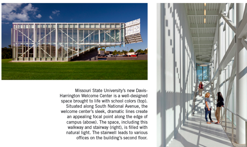
Davis-Harrington Welcome Center at Missouri State University
General Commercial Space Winner
Seeking a striking entrance to campus, Missouri State University turned to Dake Wells Architecture for its Davis-Harrington Welcome Center. Designed by the firm’s Andrew Wells with the help of Bethany Henry, Mark Wheeler and Cara Collins and constructed by Wright Construction Services Inc., the sleek, 13,000-square-foot structure captivates visitors with dramatic lines, a flexible floor plan and thoughtful design details.
Winning designer: Andrew Wells, Dake Wells Architecture, 134 Park Central Square, Suite 300, Springfield; 417-831-9904; dake-wells.com
Project summary: Replete with floor-to-ceiling windows, a large meeting space, interactive displays and plenty of school pride, this stunning welcome center draws visitors into campus and provides a destination for events.
Judge’s comments: “This building gives a sense of hope and growth in the future. Great use of natural light and pattern detail—ensures progress in an energetic environment.”
Photos by: Gayle Babcock, Architectural Images LLC
Biz 417: First impressions are essential in college recruiting. How did that influence this project?
Andrew Wells: A lot, I would say. The whole goal was to provide a sort of physical and symbolic point of entry into the campus, the idea being that they would have a worthy place for greeting visitors, prospective students and parents and guests of the university.
Biz: The building contains references to MSU’s history. Can you describe them?
AW: A lot of people that have seen the building may recognize the perforated screen that’s on the west side that sort of extends out. That’s a gesture of welcome right at the entrance to campus and it identifies the main entry point into the building. That perforation pattern was developed by scanning a typical black-and-white composition book that’s used for essays. We scanned that pattern and then digitized it and translated it into this dot pattern of circles. So that provides a sun shade to cut down on solar heat gain from the west side, but it also has this reference back to the fact that it was originally a teacher’s college and it’s all about education. The other reference is the slate wall that leads you in, which is a reference back to the old chalkboards.
Biz: This building welcomes guests, houses offices and hosts events. Was it challenging to incorporate the multiple functions?
AW: I think that was one of the issues that we had to really think through. How do we design in enough specificity that it’s identified as a university building—not just a university building, but Missouri State’s building—while at the same time being open-ended and flexible for a variety of things that we couldn’t even imagine yet.
Project Resources
Builder: Wright Construction Services Inc.
Structural engineer: IMEG Corp. (formerly KJWW Engineering Consultants)
MEP engineer: IMEG Corp. (formerly KJWW Engineering Consultants)
Civil engineer: CJW Transportation Consultants LLC
Door, frames and hardware installer: Ron Miller
Tile: Crossville Inc.
Paint: Sherwin-Williams
Fire suppression system installer: Jayhawk Fire Sprinkler Co. Inc.
Plumbing and HVAC installer: Connelly Plumbing Co.
Electrician: A-1 Electric
Irrigation, turf and plants installer: A-1 Walls and Landscaping
Concrete masonry unit: Springfield Ready Mix, 417-862-9203
Cast-in-place concrete installer: Advanced Concrete Technology Inc.
Metal work (steel handrails, steel plate bear logo and dimensional letter signage) installer: CMPI
Rainscreen panel installer: Architectural Design Concepts
Aluminum glazing system: EFCO Corporation
Aluminum glazing system installer: Builders Glass & Products Inc.
Roofing: Carlisle SynTec Systems
Roofer: Summit Roofing LLC
Days Inn Springfield South
Hospitality Winner
While renovating its Days Inn property, Walker Hospitality Group realized it wanted a sharp eye to give the project design direction. They enlisted designer Andrea M. Deckard, who didn’t have to look far to find inspiration: Bass Pro Shops, which is just a stone’s throw from the property and is a destination for many hotel guests.

“We wanted to take an approach that was giving them an earthy design that was representative of their proximity to Bass Pro Shops and kind of play into that concept of extending a guest’s stay so they can feel like they are continuing that experience of Bass Pro,” Deckard says. That required incorporating natural elements balanced with modern touches in the corridors, breakfast room, guest rooms and lobby, the latter of which sets the tone for that rustic yet contemporary vibe with features like a coffee table made from root balls and custom window sheers with a branch motif.
The natural aesthetic also came into play with a particular design challenge: creating privacy for the pool, which is visible through lobby windows. Deckard had custom window graphics made to look like layered branches and twigs, providing privacy while making a striking statement. Another smart, high-impact addition is the breakfast room’s tall community table customized with a laminate reminiscent of petrified wood.
Together, such unique touches in combination with the natural color palette create an atmosphere that’s miles from cookie-cutter. “They wanted to elevate themselves with something that was special, something that was different, something that would appeal to people traveling through who would make an effort to stay here not just because of the location, which is really great, but also because of the design,” Deckard says.

Designer Andrea Deckard used natural elements and modern touches to refresh the common areas (top) and guest rooms (middle) at Days Inn Springfield South. She also gave the cafe area a face-lift (below).

Project Resources
Office furniture: A. Deckard Interiors
Tile: Unique Tile
Paint: Sherwin-Williams
Window Graphics: A. Deckard Interiors
Window Treatments: A. Deckard Interiors
Artwork: A. Deckard Interiors
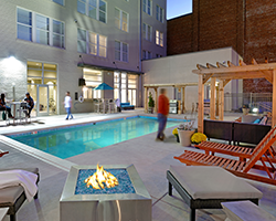
Sky Eleven
Historical Renovation Winner
Numerous organizations have called the Woodruff Building home. Considered Springfield’s first skyscraper, the building has sustained considerable wear and tear since its 1911 debut. But where others saw dereliction, developers Tim Roth and Matt Miller of The Vecino Group saw potential for dynamic multifamily housing, so they brought on Buxton Kubik Dodd Creative architect Brian Kubik and designer Joyce Buxton to execute that vision.

The Woodruff Building in downtown Springfield (left) was transformed into a jaw-dropping apartment complex.
For Kubik, the first step was assessing the building’s dilapidated state and figuring out how to make it code compliant. That required major renovations, such as having contractor O’Reilly Build LLC (then Build LLC) create a new stair tower connecting all ten floors of the building. “That was a pretty big feat to do that,” Kubik says. Once those and other key structural changes were made, Buxton got to work giving Sky Eleven a sleek, Mad Men–like vibe inspired by the 1950s, the era during which the building’s signature teal panels were installed.
That color is woven throughout the building, including on the first floor, home to several buzzing common areas. “We really wanted to make it fun for the students and their activities, so we have open areas, TVs, a workout space and a bar, [which is] a place where they could rent the space out,” Kubik says. They also had a luxe saltwater pool installed, creating another gathering place for the dozens of tenants now living in 90 fully furnished units, replacing what were once empty offices. Buxton and Kubik view such transformation as a hugely positive force in Springfield’s urban core. “That truly is what’s going to revolutionize downtown,” Kubik says.

The interior of the space was designed by Joyce Buxton and Brian Kubik of Buxton Kubik Dodd Creative. The features in the common areas and the outdoor pool make Sky Eleven an attractive residence for college students and young professionals.
Project Resources
Contractor: O'Reilly Build LLC (formerly Build LLC)
Engineer: Larry Phillips, Pellham Phillips Architectural Engineering
Structural engineer: Wells & Scaletty
Historic preservation consultant: Deb Sheals, Historic Preservation Consulting, 573-874-3779
Light fixtures: Harry Cooper Supply
Common area cabinets: Alpine Wood Products
Paint: Sherwin-Williams
Audio-visual equipment: Netwatch Inc.
Artwork: TCI Graphics Inc.
Custom woodwork: Alpine Wood Products
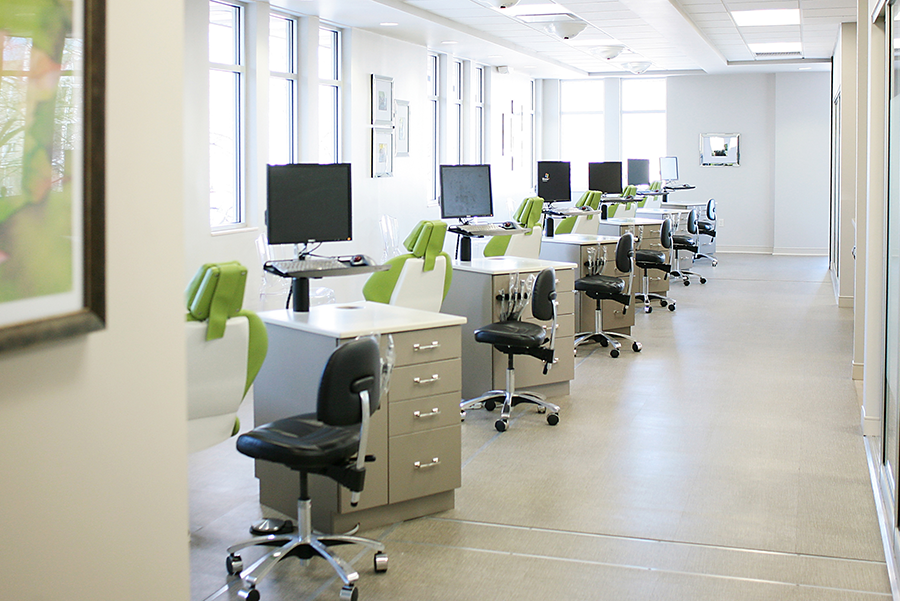
Cash Family Orthodontics
Medical Winner
Medical environments can sometimes skew into cold, institutional design territory, but Joyce Buxton and Jon Dodd of Buxton Kubik Dodd Creative sought to go in the opposite direction for Cash Family Orthodontics. When Dr. Tara R. Cash, who holds a degree in interior design, and her father, Dr. Jerry F. Cash, decided to relocate their practice, they hired Buxton Kubik Dodd and BP Builders LLC to create a space that could be tailored to their specific needs. Chief among those needs was efficient patient flow. “Everything kind of went from that or was based on that because when the patient flow works well within a dental office, the whole operation works well,” says Dodd, who was the architect on the project.

That flow starts in the waiting room, which now features wood flooring and residential-style lighting. It continues into the clinical space, to which the designers applied emphasis so it could function as efficiently as possible. They worked with Jerry to equip the open bay with custom cabinetry made to his specifications. “He actually designed down to the quarter of an inch how he wanted those cabinets to work,” Buxton says.
The clinical area also contains vibrant touches such as colorful custom-upholstered dental chairs, bringing an unexpected pop of color. “The thing that really makes this successful is just the uniqueness and the beauty of the interior design—not just the products used, but how everything worked together,” Dodd says.

Project Resources
Contractor: BP Builders LLC
Office furniture: Indoff Inc.
Hardware: Ron Miller
Hardware: CBS Cabinets
Plumbing fixtures: Harry Cooper Supply
Light fixtures: Harry Cooper Supply
Kitchen/Breakroom/Bath cabinets: CBS Cabinets
Kitchen/Breakroom/Bath countertops: CBS Cabinets
Kitchen/Breakroom appliances: Metro Appliances & More
Carpet: The Carpet Shoppe
Stone/Tile: The Carpet Shoppe
Wood floors: The Carpet Shoppe
Paint: Sherwin-Williams
Decorative paint contractor PHD Painting Inc.: 417-732-7296
Storefront/sliding glass doors: B&G Window & Screen
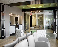
Law Offices of Kristoffer Barefield LLC
Finance/Legal Winner
When attorney Kristoffer Barefield leased space in this more than 100-year-old building, it was essentially a blank slate for Obelisk Home designers Nathan Taylor and J. Martin to transform into a beautiful brand-new office for the growing practice. “It was a great big, open space, so we had to come up with a plan to infill and give them offices and a conference room and a reception area,” Taylor says. That required getting creative, given the building’s historic bones, which were incorporated throughout the design. For example, old pine columns and beams were left visible, the concrete floor was waxed and stained but kept otherwise intact, and original brick was left exposed for a stylish effect in the gallery-like entry area.


Such industrial features fit well with the designers’ goal of creating a casual yet professional environment. “They didn’t want it to feel like a stuffy law office,” Taylor says. To create an inviting atmosphere, Taylor and Martin tucked eye-catching original artwork throughout the space. That provided appealing pops of color in spots such as the conference area, another room where a sense of warmth and welcome was emphasized in design decisions as simple as the small size of the table. “They wanted a very simple conference table,” Taylor says. “They wanted it to feel intimate.”
That focus on client experience was top of mind throughout the entire project. “Someone can come in, they can go to the restroom, they can get a cup of coffee, they can get a soda, and they feel like they can sit and wait and not feel like they are in a place that they are not really welcome or they are not comfortable,” Taylor says.
Project Resources
Office furniture: Obelisk Home
Light fixtures: Obelisk Home
Paint: Sherwin-Williams
Paint contractor: Brad Ball, Ball Painting, 417-880-4369
Audio-visual wiring: Wired AV, 417-881-1024
Artwork: Obelisk Home
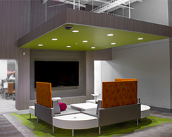
Assemblies of God Credit Union
General Office Space Winner
Assemblies of God Credit Union approached Buxton Kubik Dodd Creative to create an outside-the-box office for its new operations center that consolidates staff from member services, marketing, the call center and the executive team. Executed with the help of contractor Rex Winslow with Construct, the finished product boasts an open floor plan, high-tech audiovisual technology, amenities like a full kitchen and numerous informal meeting areas geared toward collaboration.

The new open floor plan at Assemblies of God Credit Union includes numerous informal meeting areas, so employees have their choice of inviting spaces to sit and take a quick break. The space was designed by a team of designers at Buxton Kubik Dodd Creative.
Biz 417: Why did Assemblies of God Credit Union pursue this project?
Joyce Buxton: This was really done for their staff. It’s an operations center, so by the nature of it, it’s sort of back of house. So they weren’t doing this for a show for the public. It was really to attract and retain good people. They literally said to their staff, “You are important. We want you to have a nice place to work.”
Biz: What did they want to achieve with the design?
Jon Dodd: They wanted an open environment that was kind of an exposed structure, a fun atmosphere that was colorful and collaborative. They didn’t want to just stick people in rooms with acoustic walls to separate one department from another, even though there were some areas that needed a little more acoustical control than others.
Biz: How did you provide that acoustical control?
JD: We actually kept the environments open, but we used spaces like conference rooms and other functions to kind of psychologically separate one zone from another to help acoustically separate it without making it feel like it was closed off. And then within those quieter areas we used acoustical ceiling clouds that were suspended at multiple heights within the space to help cut down on sound in those areas.
Biz: How has this project impacted the company’s staff?
JD: They were scattered in different facilities, so they never had the benefit of working together. So [there’s] a lot of synergy being together for the first time.
.png)
Project Resources
Contractor: Construct
Kitchen/Breakroom cabinets: Alpine Wood Products
Bath cabinets: Alpine Wood Products
Paint: Sherwin-Williams
Audio-visual equipment: ForresterTech
Audio-visual wiring: ForresterTech
Shades: Benton Blind